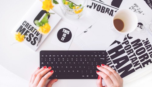
Simple Design Tips for Non-Graphic Designers
25 April 2017When you’re starting your own business then cash-flow is going to be very tight, it’s ‘all hands to the pump’ to begin with to make sure it gets off to the best possible start, doing as much of the work yourself in order to keep costs down. This includes designing and producing any marketing materials such as promotional leaflets or posters. To help you get started we’ve listed a few design tips to get you on your way and really sell your business venture without the need to hire a designer whilst money is tight.
Allowing for whitespace
Don’t fall into the trap of thinking white or blank space is bad, it’s not – it’s almost as important a your headline, it allows a design to breath. We see so many cases where customers have tried to cram in as much information as possible so they think they are getting value for money. Having a design which is too busy and which struggles to get your message across is only going to hinder your efforts. By having white space around the other key elements such as the headline and images makes it easier to read.
Fonts
Similarly to white space is the need to reign in your fonts choices. To begin with, it’s best to stick to a maximum of 2 or maybe 3 fonts. This again is intended to not complicate the design and the reader is able to absorb more. It’s a good idea to pick two completely different fonts, maybe one serif and one sans serif. Use one for the main headline or strapline and the other for the body or content text. Both fonts need to be easy to read, there are a lot of ornate and elaborate fonts out there which you can use, but once again simplicity is key. Having an over-complicated font that is difficult to read is not going to do you any favours. If you’re struggling then Pinterest is a good place to start for pairing of fonts, there are plenty of suggestions to get you started if you’re unsure of where to start. There are plenty of free font sites such as dafont.com or fontsquirrel.com so you should be able to find something a little more unique than opting for the standard fonts which are pre-loaded in your software.
It’s all about Visual Hierarchy
It’s very easy to make everything bold and everything large to try and push your message. This will only leave the overall design looking bland and uninteresting. Think of it as similar to a newspaper, by choosing to make the main headline in a large bold font and the rest of the information smaller will give your design balance. You have to remember your design has to make an impact in only a few seconds before you have lost the viewers’ attention, so stick to a large headline to hook in the reader, be careful not to use too many words either – if you can read it in less than 2 seconds, it’s about right. Then maybe a smaller sub-headline and a further smaller font for the more detailed information.

Don’t forget you’ll need a call to action at the end of the your message too, this way you can push your customers to re-act to your message, a simple ‘call us now on’ or ‘check out our website for’, these sound very straightforward but without them readers are likely to switch off after reading, so you need to direct them to take action after reading.
Get into the grid
One of the first things I was taught about design was the importance of a good grid system. Having a grid allows the design to follow a pattern; this keeps a structure and alignment to a document and gives it order. Without order, it’s possible that a design can look amateurish and cobbled together. This is particularly important if you have a multi-page document such as brochure or booklet, it makes it easier on the eye to read. All magazines and newspapers will have a grid system, obviously there are some very complicated grids out there, but yours doesn’t need to be. If you are producing a brochure then a good way to start is by creating a single page layout that you are happy with, adding in text and images etc. Then simply duplicate that page and change the information on it for the second page, that way you will have a similar layout for every page of the document and this will make it look and feel more organised.

Good photography
If you’re designing your own leaflet then there is a very good chance you’ll be taking on the photography too. So think about the composition of the image in its background, you need to focus on the image but in the same way you allowed the white space, the background of an image will allow your photo to breath if you use what called the ‘rule of thirds’. Split the design into 9 equal sections and the focus image should be where the lines intersect.

Colours
Before you decide on your colour palette, it’s best to think of your overall brand, its position in the market and how you want to be perceived. Certain colours evoke certain personalities of a brand. As has been burnt into our psyche since we were children, maybe it’s the colour of blood, Red = Danger, but it also has energy and it’s exciting. Greens and browns are usually associated with natural ‘earthy’ products and services. Colours or shades can be associated with different meanings and inadvertently affect the message being conveyed to your audience.
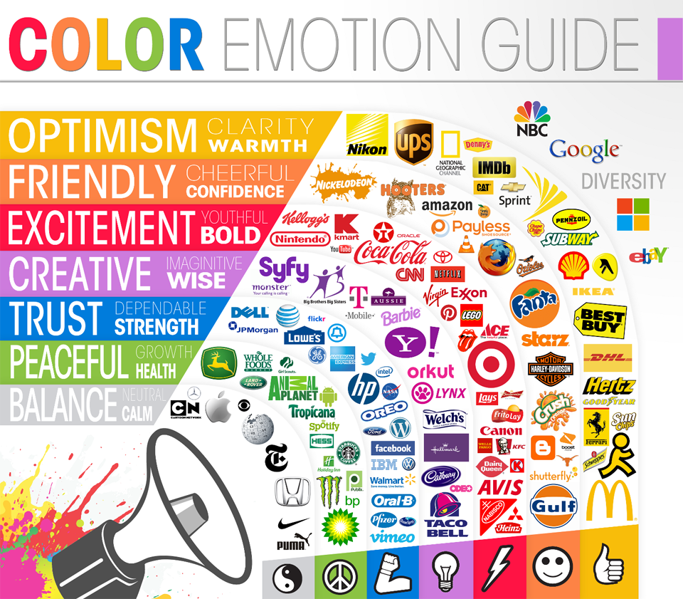
You may already have a logo designed, assuming this would already have colours associated with your area of business, so you will need to decide on other colours to compliment this. Again, less is definitely more here. Too much colour can be overwhelming and will distract from your message. Similar to your fonts, stick to 2-3 colours maximum, decide on the main colour (if it’s not already included in your logo) then you’ll need two other sub-colours to help support the main colour.
Be consistent.
You want customers to recognise your brand each time they come across it. So whatever you produce – keep it consistent. This will help build up brand loyalty overtime. It’s always good to develop your designs and refine them, but make this a gradual and organic process, drastically changing your design and particularly your logo too often will cause confusion with your customers and will erode their trust in you.
Design inspiration
If you’re struggling for some design inspiration then we really do suggest checking out Pinterest or even Behance as there are some great designers showcasing their work and you’ll be picking up ideas in no time.
Alternatively, we can design your perfect printed presentation folders for you. Contact the Folder King design team now.